
GO
Sorry, but you already have a basket with that name. Please use something else.
Are you sure you wish to delete this basket?()
This action cannot be undone.
Sorry, something went wrong
Please report the problem here.
How to use colour psychology in your secondary school library: our designer reveals the science

October 3rd 2024
Our interior designers often draw on colour psychology to inform the work they do in schools, seeking to align emotions and behaviours with the purpose of the space. Bright colours – such as red and orange – for example, are thought to encourage alertness for group activities and discussion, while softer tones like green and blue may be more suited to spaces dedicated to reading.
Read on to find out more about the benefits colour can bring to your library or classroom.
What is colour psychology?
Colour psychology mixes science and art to communicate meaning through colours. It has long been explored by physicians and psychologists, including Hippocrates and Carl Jung. In addition to evoking personal reactions, colour serves as a language to unite people and communities. This can particularly apply to young children who are not yet able to read or write, and who instead rely on visual information to make their way in the world.
“The impact of colour is something that can often be overlooked," says Peters' Interior Designer Sophia Thomas. "Colour is all around us, but have you ever stopped to think about why you chose a certain colour or how it makes you feel? It’s important to have a balance of colours that are used correctly and in the right settings. Each colour can bring amazing benefits to your space, it’s just about knowing how and where to use them.”
The benefits of colour
A 2006 study in the College Student Journal showed that certain colours can increase learning productivity by up to 10%, while research with Alzheimer's patients indicates that colour cues can improve memory. The impact on neuronal functioning - including IQ, cognition, emotional regulation and motor control - can have a huge effect on academic achievement, morale and absenteeism for both pupils and staff. One of the biggest impacts is on mood, with colours shown to inspire ideas, action and a positive outlook on life and learning.
Choosing the right colours for your learning space
Whether the space should be tranquil, focused or creative, your colour choice can really make a difference. For group discussions or detailed work, bright colours can encourage mental alertness. Spaces dedicated to reading or artistic endeavours may however be more suited to softer tones. Many schools specifically design their enviroment to have the effects of calm and tranquility. Age is also a factor: while younger children prefer bright colours, they can cause anxiety in older students, parents or teachers.
At secondary level, blue is often considered to be the most desirable colour for learning, as it promotes memory and enhances creativity.
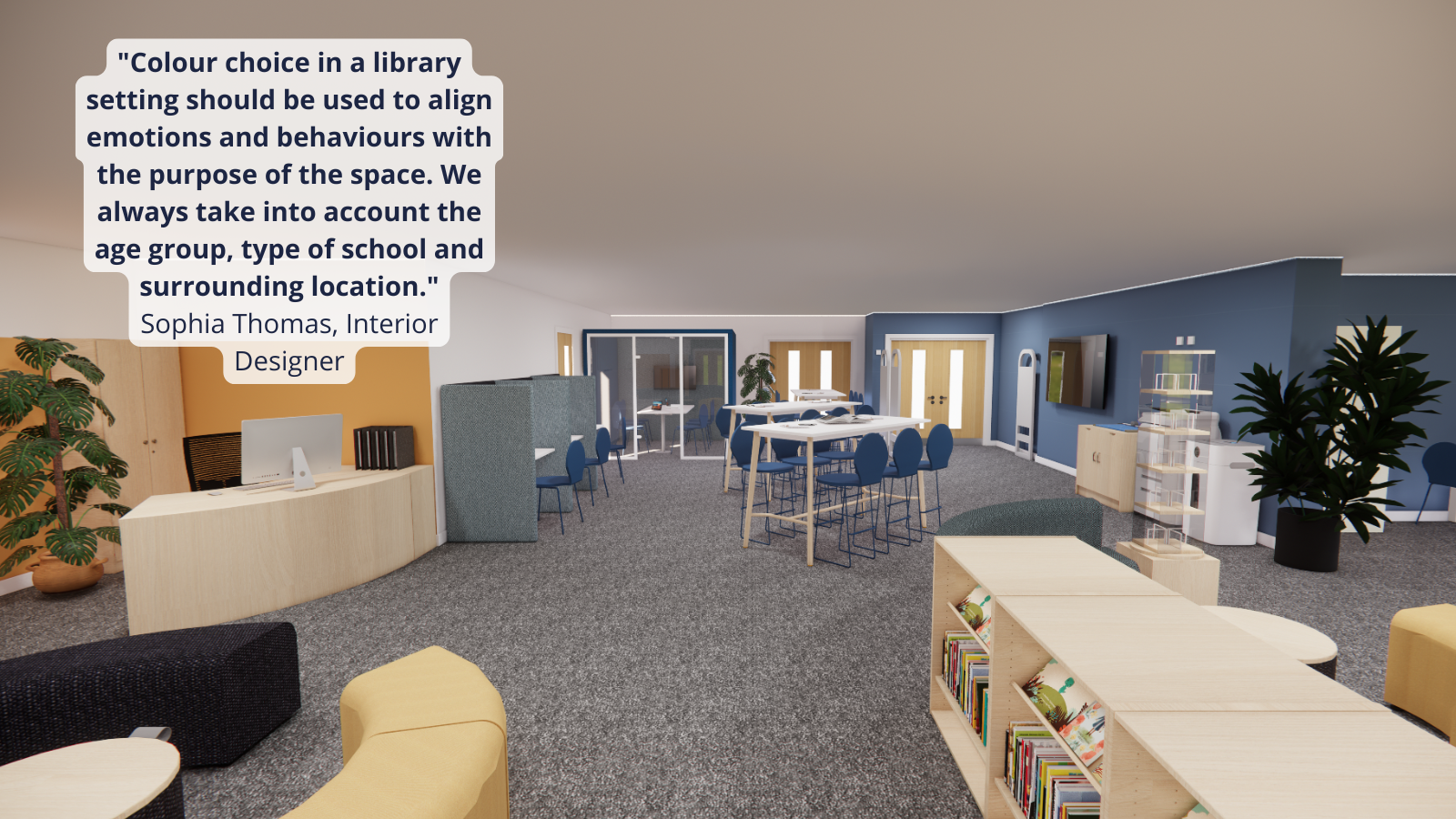
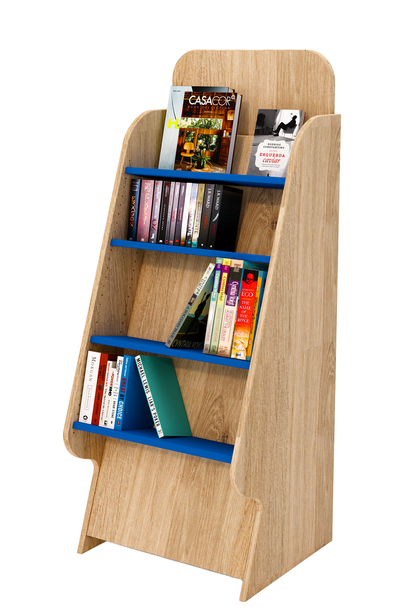
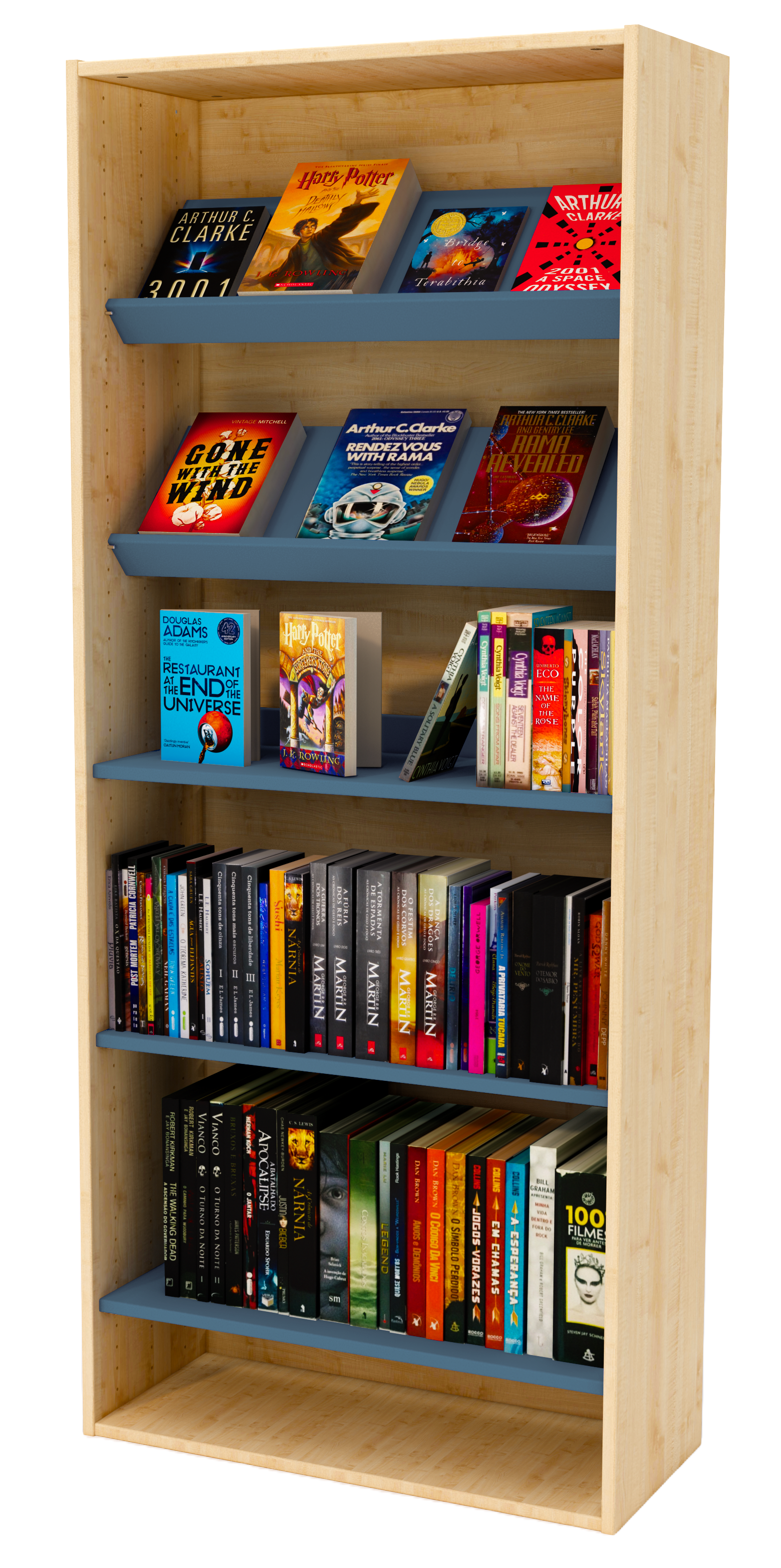
Case study: The Streetly Academy
Our recent library installation at The Streetly Academy in the West Midlands shows the power of colour! Our Senior Interior Designer Helena Thornton was inspired by the school's brand colours, navy and gold, muting them to create a modern colour scheme to suit all students from ages 11–18. She added in grey and blue finishes to modernise the space, and complement the rest of the school decor, which is mainly grey.
Helena says: "When designing a space, we tend to select a palette of five colours: two main colours for the majority of the space; an accent colour that is brought out in small pops; a lighter, neutral colour to discourage colour overload; and a complementary colour to tie the scheme together."
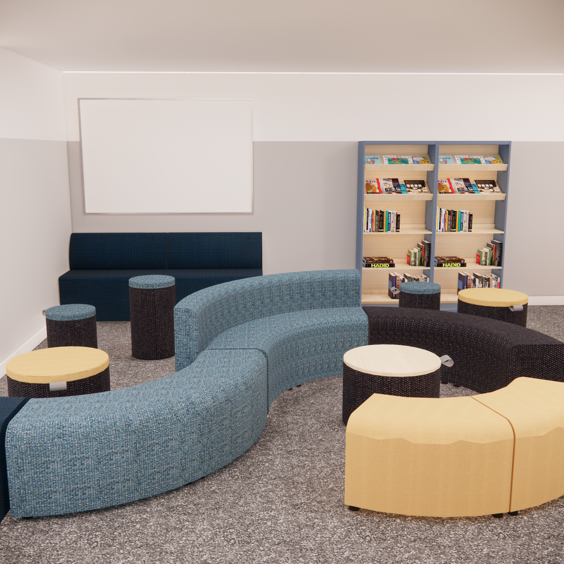
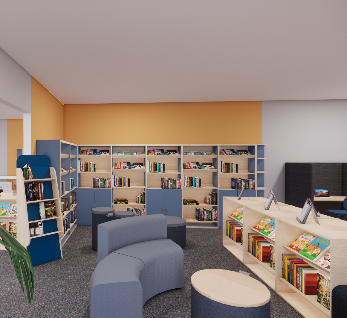
3D renders created by our interior design team for The Streetly Academy
Featured products
 |
 |
 |
 |
 |
- hello@peters.co.uk
- 0121 666 6646
- Send a message
- Meet the team
- Peters Ltd
- 120 Bromsgrove Street
- Birmingham
- B5 6RJ


")